Why I’ll Always Defend Neutral Interiors
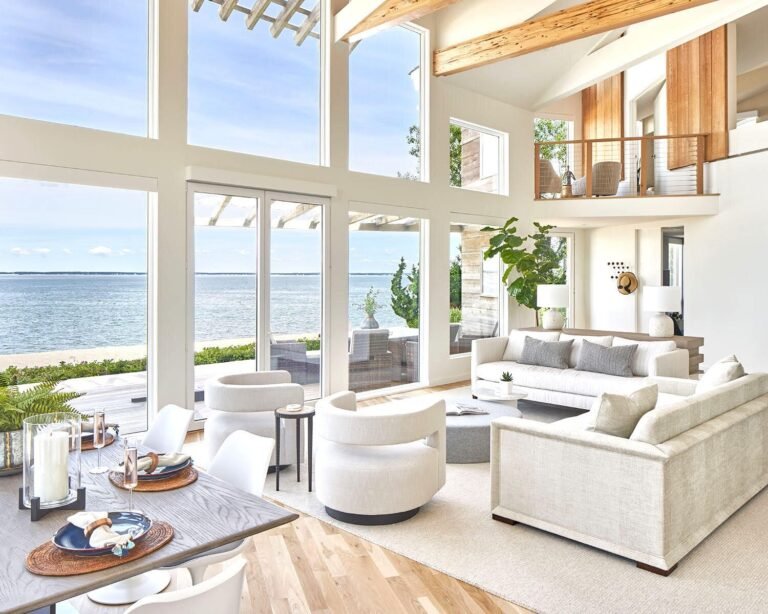
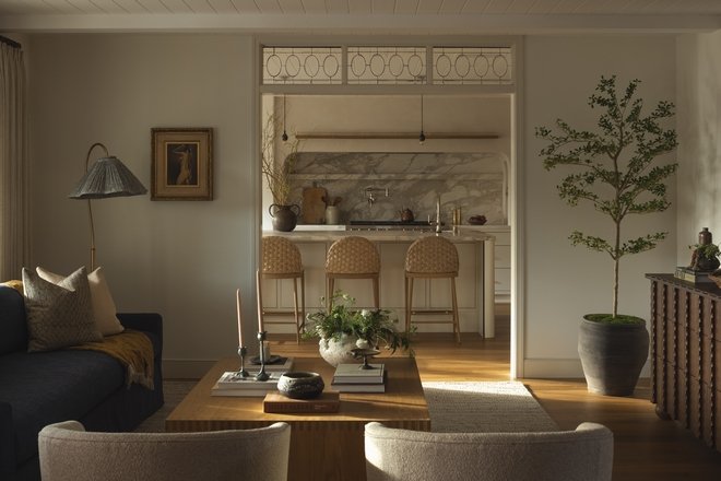
Neutral interiors often get a bad press for being boring or uninspiring, but I think the opposite can be true. Some of the most interesting rooms I have designed have been predominantly neutral. The key is making sure there is enough contrast, texture and variation within the scheme so that it feels layered rather than flat.
If you take color away, every other element in the room has to work that little bit harder. These are the things I always consider when decorating with neutrals.
1. Mix Different Tones

(Image credit: Sophie Paterson Interiors)
One of the biggest mistakes you can make with a neutral scheme is keeping everything within the same mid-tone palette. You need contrast, from very light off-whites and creams through to taupes and browns, with much darker accents of bronze, graphite or even black.
Latest Videos FromHomes and Gardens
It is the juxtaposition of light and dark that gives a neutral room depth. For the main pieces of furniture, I might have one lighter sofa alongside another upholstered in a mid-tone fabric, then introduce something darker or more textural on the armchairs.
Neutral schemes tend to fall flat when every item is almost exactly the same color. Don’t be afraid of those darker notes. They are often what make the lighter elements feel more beautiful.
2. Mix Your Textures

(Image credit: Sophie Paterson Interiors)
Texture becomes even more important when you are working with a limited color palette. I would rarely use the same type of fabric across all the upholstery in a room. If you have linen on one sofa, you could use velvet, mohair or wool on another. The same applies to pillows. If every pillow is the same texture, even if they are slightly different shades, the overall effect can still feel quite flat.
I find that a room can take far more texture and pattern than you might imagine when looking at everything together on a moodboard. Fabrics and finishes are very concentrated when they are sitting next to one another on a small board, whereas once they are dispersed around a room, the effect becomes much more subtle.
Pillows are also a wonderful opportunity to use more luxurious or decorative fabrics. I love introducing a silk velvet or an embroidered fabric that perhaps wouldn’t be practical across an entire sofa or chair. The same principle applies to rugs, lamps and accessories.
3. Be Bolder with Your Accent Pieces

(Image credit: Sophie Paterson Interiors)
In a neutral room, an interesting object has so much more impact. A beautiful ceramic lamp in an accent color, for example, really stands out against a quieter backdrop.
I wouldn’t use the same material for every lamp or accessory either. If you have several table lamps in a room, which I think you should, mix ceramic with glass, metal or plaster and look for forms that are a little less obvious.
In my own living room I have a heavily textured plaster lamp from Porta Romana. It wasn’t necessarily the most obvious choice, but the texture relates to a bouclé pillow and a hammered frame nearby. Those small connections help make a room feel considered without everything having to match.
4. Mix Different Styles of Furniture

(Image credit: Sophie Paterson Interiors)
Furniture has to work harder in a neutral scheme because you don’t have color doing the heavy lifting. This is where mixing different periods and styles becomes particularly important.
I love combining antiques with contemporary furniture because it immediately gives a room more character and creates a much more timeless, collected feel. A beautifully carved antique table next to a very sleek contemporary sofa, for example, introduces a tension that you simply don’t get if everything is from the same period or collection.
The same applies to materials. Avoid having every table and cabinet in timber. Bring in stone, metal, glass or plaster so there is enough variation. This is often what takes a neutral room away from that slightly generic, developer look.
5. Pay Particular Attention to Lighting

(Image credit: Sophie Paterson Interiors)
Lighting is important in every interior, but especially so in a neutral room if you want it to feel warm and inviting.
I always prefer to layer lighting rather than rely on a ceiling full of spotlights. Directional spotlights can be incredibly effective when they are positioned to highlight something specific, perhaps a narrow beam onto a painting or a pool of light falling directly onto a table. I would never position a downlight directly above seating.
Then add an even spread of table lamps around the room. I think every sitting room should have at least two, and usually more.
The color temperature of your bulbs makes an enormous difference too. I generally recommend 2700K, which gives a warm, natural light without becoming overly orange or distorting the colors within the room. I also look for a high color rendering index, ideally a CRI of 90 or above. This allows the colors and textures in your fabrics, artwork, and finishes to appear much closer to how they look in natural light and prevents the lighting from making your scheme look flat.
Changing your bulbs is one of the easiest ways to improve the atmosphere of an existing room without redecorating it. Tala does the best bulbs in my opinion and has a CRI of 95.
‘Neutral schemes tend to fall flat when every item is almost exactly the same color. Don’t be afraid of those darker notes.’
6. Let Your Accessories Evolve

(Image credit: Sophie Paterson Interiors)
One of the things I love most about having a neutral base is how easily you can change the feeling of a room through accessories. You can introduce more color when you want it and adapt the room throughout the year to reflect the changing seasons.
In spring and summer, I bring in lots of green foliage from the garden. In fall and winter, I reuse the same dried branches and twigs, mixing them with fresh flowers and more seasonal arrangements.
In my sitting room, the wallpaper is a very subtle blue-gray silk. I’ve picked up on that hint of blue with a collection of blue and white chinoiserie vases, which I arrange across the fireplace mantel and on tables around the room. Against a neutral background, these small injections of color have far more impact.
7. Don’t Forget the Art

(Image credit: Sophie Paterson Interiors)
Just because your room is neutral doesn’t mean your art needs to be. In fact, a colorful oil painting can look particularly beautiful in an otherwise quiet room because it becomes a real focal point.
Equally, if you prefer tonal artwork, vary the medium instead. Mix oil paintings with pencil drawings, photography, ceramics and other three-dimensional pieces. I would always rather see a collection that has developed over time than a group of pieces chosen simply because they all match.
8. Every Neutral Room Still Needs Some Color

(Image credit: Sophie Paterson Interiors)
Even the most neutral room benefits from a small amount of color. The important thing is to make sure that color feels balanced around the space rather than concentrated in one area.
If you have a colorful piece of art on one side of the room, for example, pick up one or two of those colors elsewhere, perhaps in a pillow, lampshade, or accessory on the opposite side. It doesn’t need to be an exact match. You are simply creating a visual connection that helps the room feel balanced.
9. Warm Up Cooler Neutrals

(Image credit: Sophie Paterson Interiors)
If you’re starting a scheme from scratch, I think warmer neutrals such as cream, taupe, tan and brown feel both more current and more enduring than cooler gray tones.
But if you already have a very gray interior, don’t feel that you need to start again. Introducing warmer tones through a few carefully chosen pieces can completely change how it feels. Tan, burgundy, and warm brown all work particularly well with gray and can make an existing scheme feel softer and more updated.
10. Don’t Try to Match Everything Perfectly and Experiment!

(Image credit: Sophie Paterson Interiors)
My final piece of advice is not to become too preoccupied with making every neutral or accent color match exactly. In fact, I think a room is more interesting when they don’t.
Different tones of the same color will give you far more depth than repeating one precise shade throughout. Move things around, borrow pieces from other rooms and experiment with combinations you might not initially have considered.
Some of the best rooms aren’t perfectly planned from the outset. They evolve over time as you add things you love, and I think neutral interiors particularly benefit from that approach. A neutral room should never feel empty or bland. Done well, it should feel layered, warm and full of character, with enough restraint to allow every beautiful detail to be noticed.

(Image credit: Sophie Paterson Interiors)
Interior designer Sophie Paterson is one of Homes & Gardens’ Editors-At-Large for By Design, sharing her thoughts on decor. See the rest of her articles here. Explore the Sophie Paterson Academy to learn her complete design process, or join The Mood Board Community for ongoing inspiration, expert advice, and access to Sophie and the SPI team.
Love beautiful design ideas, expert advice, and inspiring decor trends? Sign up for our newsletter and get the latest features delivered straight to your inbox.